
Most lists of productivity metrics are written for teams that look nothing like yours. They come out of large software organizations, they assume somebody on staff owns reporting, and underneath it all they assume the goal is to squeeze more output out of every hour.
If you run an agency or a freelance business, that framing is wrong. You are not optimizing an assembly line. You are selling a fixed and fairly small amount of time and expertise, and the whole game is making sure that time is priced correctly, spent on the right work, and actually paid for.
So this list is built for that. Fifteen metrics, each with the actual formula, a realistic range, and what to do when the number comes back bad.
But let me put the important part first, because it is the part most articles like this leave out: you should not track all fifteen. Most people reading this should track five. The other ten are diagnostics you reach for when something specific feels broken, the way you would reach for a specific wrench. Tracking all of them is how dashboards end up beautiful and ignored.
How to read this list
I have split the fifteen into three tiers.
Tier 1 is the five that tell you whether the business is healthy. If you track nothing else, track these.
Tier 2 matters once you have people other than yourself delivering the work. Before that, most of these collapse into the Tier 1 numbers.
Tier 3 is diagnostic. Do not put these on a dashboard. Pull them when something feels off and you want to know why.
One note on the benchmark ranges. Where I give a number, it comes from what I see across service businesses and from published agency benchmark surveys, and it is a starting point rather than a law. Your discipline, your market, and your pricing model all move these. The useful signal is almost never the absolute number. It is the direction it moves over six months.
Tier 1: the five that actually matter
1. Effective hourly rate
How to calculate it
Total project revenue ÷ total hours actually spent on it
What good looks like
At or above your target rate. If it lands 20% to 30% below what you quote, the problem is your scoping, not your pricing.
This is the single most useful number in a service business, and it is the one flat-fee pricing is best at hiding.
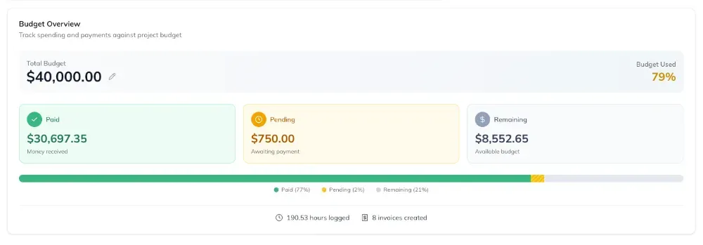
A $10,000 project that took 40 hours is a $250 per hour project. The same $10,000 project at 120 hours is an $83 per hour project. Identical invoice. Completely different business. If you only look at revenue, those two look the same, and you will happily sell more of the second one.
Track it per project and per client, never just as a company-wide average. The average is almost always fine. The average is what hides the one client quietly paying you $60 an hour for work you priced at $175.
2. Project margin
How to calculate it
(Project revenue − project cost) ÷ project revenue × 100
What good looks like
50% to 60% on established retained work. New or unusually complex projects run lower. Anything under 30% needs a reason.
Margin is effective rate with the cost of delivery subtracted, which makes it the number that matters once you are paying other people to do the work.
The part people get wrong is the cost side. Project cost is not salary divided by 2,080 hours. It is the loaded cost: salary plus payroll taxes, benefits, software seats, and a share of overhead, divided by that person’s realistically billable hours, not their total hours. Loaded cost usually lands somewhere between 1.25x and 1.4x base salary. Use the low number and every project looks great on paper.
If you are solo, skip this one for now. Your margin and your effective rate are close enough to the same thing that tracking both is just extra work.
3. Utilization rate
How to calculate it
Billable hours ÷ total hours worked × 100
What good looks like
60% to 75% for a working owner. 70% to 85% for a full-time delivery person. If someone is at 100%, something is wrong.
Utilization gets misused more than any other metric here, so it is worth being precise about two things.
First, the denominator. Use hours actually worked, not a fictional 40. If someone works 52 hours and bills 38, that is 73% utilization and a person heading for burnout. Divide by 40 instead and you get 95%, which looks like a star performer. Same human, opposite conclusion.
Second, higher is not better. Sustained utilization above roughly 85% means there is no slack in the system for sales, for training, for fixing your own broken processes, or for the project that runs long. Teams at 95% utilization feel productive and cannot absorb a single surprise. The goal is a healthy number you can sustain, not a maximum.
4. Estimate accuracy
How to calculate it
Actual hours ÷ estimated hours × 100
What good looks like
90% to 110%. Consistently above 120% means you are systematically underestimating.
This is the quiet one, and it is the metric that fixes the three above it. Most margin problems are not pricing problems. They are estimating problems wearing a pricing problem’s clothes.
What makes this metric worth the effort is that the error is almost never random. People underestimate in the same direction, on the same type of work, by roughly the same amount, over and over. Which means it is correctable in a way that most business problems are not. Once you know that your team runs 35% over on anything involving a third-party integration, you can just multiply. That is a real fix and it takes one afternoon of looking backward.
Track the direction of the miss, not only the size. And track it by work type. A blended average across every kind of project tells you nothing you can act on.
5. Days to payment
How to calculate it
Average of (date paid − date invoiced) across all paid invoices
What good looks like
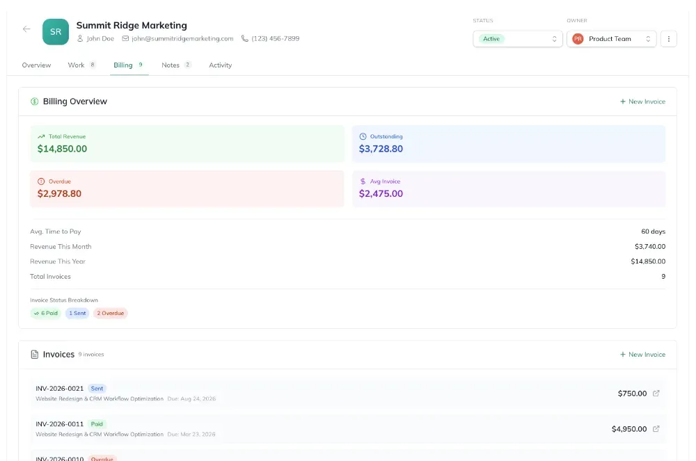
Net 30 terms should produce 32 to 38 days in practice. Past 45 you have a collections problem, not a terms problem.
Profitable businesses die of cash flow, not of bad margins. This is the metric that catches that.
Track it per client, because the average will lie to you. A client who reliably pays at 60 days is meaningfully more expensive than one who pays at 30, and that cost never shows up anywhere in your pricing. If you have one of those and you are also giving them a volume discount, you are paying twice for the privilege.
The fix is usually boring and mechanical: invoice on a fixed day rather than when you remember, put payment terms somewhere the client actually reads, and send the reminder at day 31 instead of day 50.
Tier 2: add these once you have a team
6. Capacity versus committed hours
How to calculate it
Committed hours over the next 4 weeks ÷ available hours over the next 4 weeks × 100
What good looks like
85% to 95%. Above 100% means you have already sold work you cannot deliver on time.
This is the only forward-looking metric on the list, which makes it disproportionately valuable. Everything else here tells you what already happened. This one tells you about the month you are about to have, while you can still do something about it.
7. Scope creep rate
How to calculate it
(Final delivered hours − originally scoped hours) ÷ originally scoped hours × 100
What good looks like
Under 10%. Consistently above 25% means your statement of work is too vague or you are absorbing change requests for free.
Worth separating from estimate accuracy, even though they look similar. Estimate accuracy is you being wrong about the work. Scope creep is the work genuinely changing. The first is fixed by better estimating. The second is fixed by better contracts and by actually sending the change order.
8. Rework rate
How to calculate it
Hours logged against work after it was first marked done ÷ total hours on that work × 100
What good looks like
Under 10%.
Rework is invisible in most tools and expensive in every business. It is the cost of unclear briefs, skipped reviews, and approvals that happen after the work instead of before it.
It is also the metric most likely to change behavior once people can see it, because nobody enjoys doing the same task twice and it is genuinely satisfying to watch the number fall.
9. Client concentration
How to calculate it
Largest client's trailing 12-month revenue ÷ total trailing 12-month revenue × 100
What good looks like
No single client above 25% to 30%.
Not strictly a productivity metric, but it belongs here because it changes how you should read every other number on this list. A team running at wonderful margins where 60% of revenue comes from one client is not a healthy business. It is one email away from a very bad quarter.
10. Revenue per full-time person
How to calculate it
Trailing 12-month revenue ÷ number of full-time-equivalent people
What good looks like
Commonly $150k to $250k for service businesses, but this one varies enormously by discipline and market.
I am including this because it is on every list, and I want to be honest that it is the weakest metric here. The range is so wide across strategy work, design, development, and production that a single number tells you very little. It is useful as a trend line for your own business over several years. It is close to useless as a benchmark against anyone else.
Tier 3: diagnostics, not dashboard items
These five are worth knowing how to calculate. They are not worth watching continuously. Pull them when delivery feels slow and you want to know where the time is actually going.
11. Cycle time
How to calculate it
Average of (date moved to done − date work actually started)
What good looks like
No universal target. Compare against your own history, per type of work.
Useful for spotting when a category of work has quietly gotten slower. Measure it per work type. A blended cycle time across a two-hour fix and a six-week build is a number with no meaning.
12. Work in progress
How to calculate it
Count of tasks in an active state at a given moment, per person
What good looks like
1 to 3 per person. Above 5 and throughput starts falling.
If I could get one operational change adopted more widely, it would be this one. When delivery feels slow, the instinct is to push people to work harder. The actual fix is almost always to have everyone work on fewer things at once. Every parallel task carries a context-switching tax, and that tax compounds fast.
13. Wait time
How to calculate it
Time a task spent blocked or awaiting input ÷ total cycle time × 100
What good looks like
Frequently over 50%, which is the point.
The first time most teams measure this they find the majority of a project’s elapsed time was spent waiting, usually on client feedback or an internal approval. That reframes the whole problem. You cannot fix a two-week delay by working faster during the three days of actual work.
14. Meeting load
How to calculate it
Hours in meetings ÷ total hours worked × 100
What good looks like
Under 15% for people whose job is delivery.
Straightforward, and worth a look once a quarter. The number is usually higher than anyone guesses.
15. On-time delivery rate
How to calculate it
Milestones delivered on or before the committed date ÷ total milestones × 100
What good looks like
85% or better.
The one metric on this list your clients would also choose. It correlates with renewals more strongly than quality does, which is uncomfortable but worth knowing.
Four metrics that make things worse
Some numbers are not just useless. They actively push people toward worse behavior. I would avoid these.
Tasks completed. Rewards splitting work into smaller tickets. You will get a beautiful upward chart and exactly the same amount of work done.
Hours logged, as a measure of productivity. This rewards the slowest path to a result and quietly encourages padding. Log hours for billing and for estimate accuracy. Do not use the raw total to judge anyone.
Utilization, when pushed toward 100%. Covered above, but worth repeating because it is the most common way a reasonable metric turns harmful. The moment utilization becomes a target, people start classifying things as billable that are not.
Any metric nobody has ever acted on. If a number has been on your dashboard for six months and has never once changed a decision, it is decoration. Remove it. The cost of a dashboard is not the tracking, it is the attention.
How often to actually look
A schedule that seems to hold up:
- Weekly: capacity versus committed, work in progress. These are the two you can still act on.
- Monthly: effective hourly rate, project margin, utilization, estimate accuracy, days to payment.
- Quarterly: client concentration, revenue per person, meeting load.
- When something feels wrong: the Tier 3 diagnostics.
Where to start
If you are solo, start with three: effective hourly rate, estimate accuracy, and days to payment. That is a spreadsheet with three columns and about twenty minutes a month, and it will tell you more about your business than any dashboard you could buy.
If you have a team, add project margin and utilization. That is the five.
Everything else on this list can wait until you have a specific question those five cannot answer. Which, honestly, is not that often.
The reason most of this goes untracked is not that the math is hard. It is that the data lives in four different places. Hours in one tool, budgets in a spreadsheet, invoices in accounting software, and the actual project status in somebody’s head. Pulling a single accurate effective hourly rate becomes a forty-minute job, so it happens once and then never again.
That is worth solving before you worry about which fifteen metrics to track. Whether you fix it with a shared spreadsheet, a reporting tool, or something that keeps time and budgets and invoices in the same system, the goal is the same: make the five numbers cheap enough to look at that you actually look at them.

Brendan Shulman
Founder & CEO, FeatureFlight
Brendan Shulman is the founder and CEO of FeatureFlight and a software engineer with a passion for building useful, intuitive products. He writes about project management, productivity, software, and the lessons he’s learning while building and growing FeatureFlight.
Keep reading
- How Many Tools Is Your Agency Paying For? A Tool Sprawl Audit, With Real Prices
What a typical agency software stack costs at 1, 5, and 20 people, which tool sprawl stats hold up, and a 90-minute audit to decide what to keep, merge, or cut.
- The Agency Client Onboarding Checklist: From Signed Contract to Day 14
A client onboarding checklist for agencies: 12 steps from signed contract to day 14, with the templates, the kickoff agenda, and the six you can't skip.